Presidential pie chart:Not endorsing
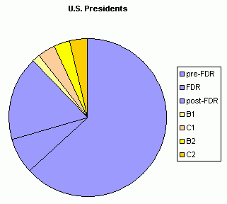
this anti-Hillary Clinton op-ed, but it is interesting how much a Bush-Clinton-Bush-Clinton presidential series would be as a fraction of all the years the U.S. has had a president. To see it graphically, a pie chart can be used:

"All other presidents" are blue. For reference, Franklin Roosevelt's four terms are shown as a division within the blue, and
for a full 16 years (to show what the public voted for).
In any event, the Bush-Clinton series does take up a good chunk. Two hundred years from Washington to Reagan. Up to twenty-eight if B1, C1, B2, C2 becomes a reality.
posted by Quiddity at 10/08/2007 05:40:00 AM
The Adamses were related. The two Roosevelts weren't far on the family tree. I don't have a problem with the pie chart or asking what this says about the country, but I have a problem with no one mentioning the cause of an apparent Bush/Clinton/Clinton/Bush/Bush/maybe Clinton run: money.
It costs too damn much to run now, money wins (in the primaries), and the process is screwed well before November election days. Ron Paul, Tancredo, Huckabee, Richardson and the also-rans behind the big money makers have no chance right now. It's all Giuliani/Romney v. Clinton/Obama because they have the political machines. If anyone other than those four wins the Presidency, it will be because of at least two of their deaths.