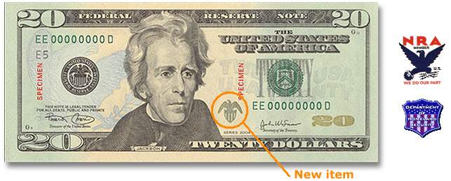
Sending a message? The U.S. Treasury has
announced yet another change in the look of paper currency. The first bill redesigned is the $20. Most of the changes have to do with the background and use of subtle colors. For example, the reverse is virtually identical to the current one - except that an oval framing the White House is gone. The front also drops the oval which framed Jackson. And that's about it - except for a small addition. There is a small dark eagle sitting on a crest which looks like a strange amalgam of the 1930's
National Recovery Act eagle, and the
Department of Homeland Security shield. Did Tom Ridge have input on the design?
 posted by Quiddity at 5/13/2003 12:40:00 PM